


This site was based on the Stars Dark themem from Adobe Kuler
Assignment Resources
Embedding Fonts
Google Fonts can be added to your site and are downloaded when the page is loaded using an http request. For this page I used both Open Sans and Overlock SC font families. Notice that the Open Sans is using two different weights, 300 and 600. Instead of using two different http requests, I combined them together using a bar as shown below.
family=Open+Sans:300,600|Overlock+SC
Read more about Optimizing Multiple Google Web Fonts
TopCSS Gradients
CSS Gradients are easy and use and supported on all modern browsers. You have to use prefixes to handle the possibility that you customer is using an older. This website will allow you to easily create complex gradients using a Photoshop like interface. In addition to making a gradient from one color to another, you can also use RGBA colors to include color transparency. The menu bar uses an rgba gradient over the nav color to create a gradient.
background: linear-gradient(to bottom, rgba(255,255,255,0.3) 0%,rgba(0,0,0,0.2) 100%);
Top
Shadows
CSS drop shadows give your page a sense of dimension on the Z axis. Text shadows as seen on the page name can help define the lettering. BE CAREFUL not to overuse this!
This is an example of a drop shadow
box-shadow: 4px 4px 8px rgba(0,0,0,.7);
This is an example of an inset shadow
box-shadow: 0 0 6px rgba(0,0,0,.7) inset;
This is an example of a red glow
box-shadow: 0 0 5px #5c0000;
Top
Textures
Background textures can add interest but must be used with caution. It's really easy to go overboard and make you site look hideous. This site uses the "Soft Wallpaper" texture from Subtle Patterns in the content area. I also used a star field repeating texture from star net blog who is now OUT OF BUSINESS so you can try a1stars.com instead. The star field was originally 282,993 bytes but I compressed it using JPEG quality of 1, yes one, and got the size to 10,747 bytes which is 1/25th of the original size.
Noqta is a site that features bright and colorful background textures.
TopRound Corners
Rounded corners are easy and use and well supported on all browsers except old versions of IE. I use them on navigation buttons as well as page structure elements. This page features rounded corners on the top but not on the bottom. Be careful with rounded edges as you can easily create a disaster of your site.
Even rounded
border-radius: 14px;
Top Rounded
border-top-left-radius: 11px; border-top-right-radius: 11px;
Rounded Bottom
border-radius: 90px / 15px;
Pinched
border-bottom-left-radius: 130px 5px; border-bottom-right-radius: 130px 5px;
Ball
height: 60px; width: 60px; border-radius: 30px;
Read more about borders from The art of the web
TopTransparency
CSS supports transparency in a couple of ways. First, you can specify an rgb color with an alpha values know as rgba(). The bar below "Assignment Resources" at the top of this page uses rgba with an alpha value on the left of 1 (no transparency) and an alpha value on the right of 0 (fully transparent).
rgba(91,0,0,1)
rgba(91,0,0,0)
Second, there is opacity with a value between 0 and 1. The social media icons at the top of this page have an alpha value of .7 which changes to an opacity value of 1 on mouse hover (desktop only)
header ul.icons a {opacity: 0.7;}
header ul.icons a:hover {opacity: 1;}
Top
Transitions
CSS Transitions can be applied to almost any CSS property. You will need to specify what property gets transitioned, how long it take the transition to happen, and the effect used. Below is a shorthand version which is transitioning the opacity over 1/2 a second using ease. Do not place the transition code in the :hover CSS or it will only work half the time.
transition: opacity .5s ease;
The navigation links on the desktop version of this page use a background transition to darken the menu when you move your mouse over them.
transition: background-color 5s ease;
The social media icons at the top of the page also have an opacity transition applied (only on the desktop version of the site). Below is the complete code showing the anchor as well as the a:hover.
header ul.icons a  {transition: opacity .5s ease;}

header ul.icons a:hover  {opacity: 1;}
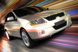
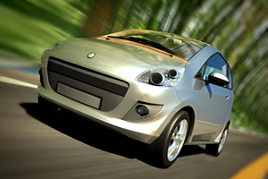
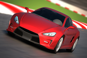
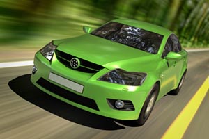
You can also transition the size of an image as show in the example below.
These images are 300px wide by 200px tall. I scaled them to 25% of the page wide using the CSS.
#content ul.carpics li {
width: 25%;
}
Then on mouse hover (desktop version only) the CSS scales them to 150% using transform. This makes the images instantly jump larger.
#content ul.carpics li a:hover img {transform: scale(1.5);}
To make the transition smoother, I added a transition to make the images grow over 1/2 a second.
#content ul.carpics li a img {transition: transform 0.3s ease-in-out;}
You can read more about CSS transitions on A List Apart
TopLarge Desktop Backgrounds
The markup for this page starts out with the body tag which contains a "wrapper" division which hold a "container" division. The "container" division then holds the header, nav, page content and footer. The addition of the extra "wrapper" division makes it possible to add the sun and blue glow to the desktop version of this page.
body

div id="wrapper"

div id="container"

/div

/div

/body
Since this image is loaded in the desktop.css it is not loaded on the phone or tablet. Therefore, it does not affect the page download speed for mobile devices.
background:url(glow.png) no-repeat center top;
You can read more about creating background on the web designer wall. Just don't overdue it.
TopBorders on Steroids
There are three properties required to make a border and they can be listed in the shorthand version in any order. You need to specify thickness, style and color. The dotted line separating each section of this page was created using the CSS below.
border-bottom: dotted 2px #ccc;
What you may not know is that you can use borders to create the footer at the bottom of this page. First you add a couple of empty divisions.
 div class="left" /div>

 div class="right" /div
Next place them in the correct spot using the position property. These are 20px wide and placed 20 px above the footer.
footer .left, footer .right {
		position: absolute;
		top:-20px;
		width: 20px;
		height:20px; }
Finally specify two borders (one of them transparent) the get the angled look.
border-right: 20px solid #976001;

border-top: 20px solid transparent;
This works because there are only two borders created and they are as thick and the box is wide and tall. this creates a 45° angle. When the second border is transparent then you can see through to the background.
You can read more about using borders on how to create.
Top